ZIMUTE
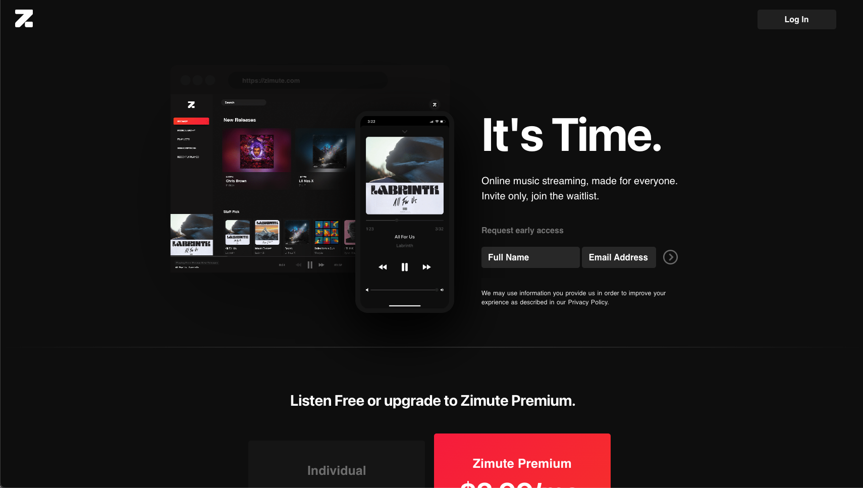
UX Case Study: ZIMUTE
Role: Product Designer/UX Designer
Client: ZIMUTE MEDIA INC
Software: : Adobe XD, Figma
Problem
Users look to explore new artists and new tracks but music streaming services don't usually offer suggestions that are catered to the users likes or music taste. Also users want to be able to create and customize playlists according to their preference and want more features other than just streaming music.
Solution
Design a streaming service that offers great recommendations to users based on their music taste while giving full customization options to the user to create playlists. Also provide more features like podcasts and other events
Research
A structural equation model of survey data shows that feature satisfaction positively affects both asset specificity of and overall satisfaction with streaming platforms, strengthening user loyalty. In addition, I wanted to get a sense for how music connects with people and how they relate. Music has such an effect on emotions, intelligence, creativity and just a person’s well-being. Sharing music brings people together, supporting empathy, trust, and cooperation.
Insights
I was able to gather key insights from my research and findings. The biggest insights I discovered were related to playlists, recommendations, sharing, and music choice.
Users commonly create or find playlists for various occasions.
Users like receiving recommendations for new music from other people.
Users have difficulty sharing with users on different platforms.
Users don’t enjoy listening to songs they dislike.
Needs
Rounding back to the empathy map by referencing the insights, I built a list of user needs that would dictate many decisions moving forward in the creation of the social feature.
Users need to know they can organize their music.
Users need to know they can connect with others about music.
Users need to be confident they can share music.
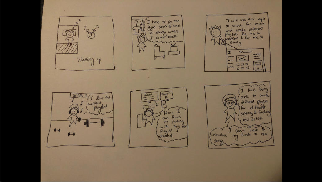


- Storyboard
I was able to create a storyboard with all the data I gathered from research
- Persona
Using the insights and research, I was able to build a persona that would represent the user - Mason. He loves discovering new music with minimal effort.
- Sitemap
Choosing the main entry point was a big decision. While I didn't want to disrupt users' current flow, I still wanted to give quick and constant access. I decided to place it within the existing homepage where users are already browsing music.
- User Flows
The user flows detail the straightforward flows of the users as they would navigate the app in order to satisfy the tasks and scenarios.
- Task Flows
The task flows detail the various decisions the users make as they navigate the app based on the scenarios.
More Paper Wireframes


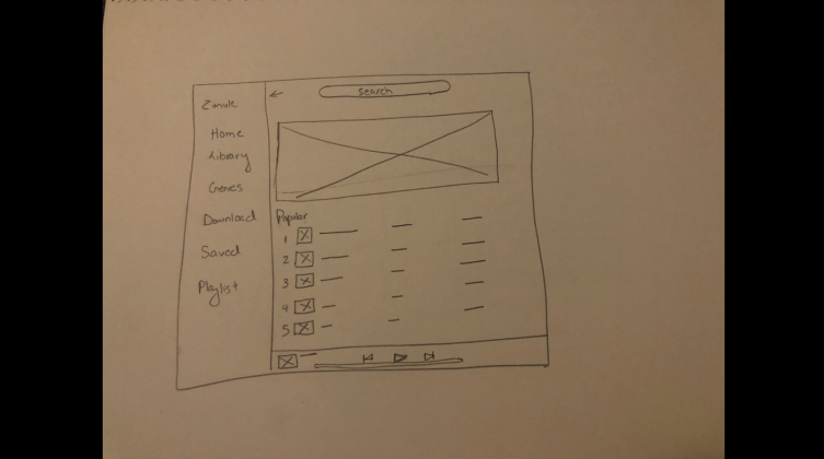
Low Fidelity Mockup
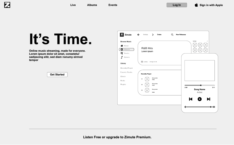
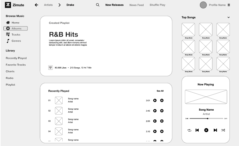
After iterating through a lot of ideas and wireframes i came up with a low fidelity mockup.
