The Revenant
UX Case Study: The Revenant
Concept horror game UI design
What I did
- Research
- Design UI icons
- Wireframes
- Prototype
My Tools
- Adobe XD
- Procreate
Objective
The objective of this case study is to outline the UI design concept for "The Revenant," focusing on creating an intuitive and immersive user experience that enhances the horror and action elements of the game.
.5b6173cb.jpg)

- Research and Analysis
Conducted extensive research on horror video games and user interface design principles to understand player expectations and industry standards.
- Conceptualization
Brainstormed ideas and concepts for the UI design, considering the dark and atmospheric nature of the game. Explored different visual styles, color schemes, and typography choices to evoke a sense of horror and suspense.
- Prototyping
Created prototypes to map out the layout and functionality of the UI elements. Prioritized ease of navigation and accessibility while maintaining immersion and thematic consistency.
- Visual Design
Designed a visual design language that reflects the eerie atmosphere of the game. Utilized dark tones, ominous imagery, and subtle animations to enhance immersion and evoke feelings of tension and fear.
More Visuals
.5b6173cb.jpg)
.9ef8874c.jpg)
.744e605b.jpg)
.cfc1b522.jpg)
.188ff0eb.jpg)
.b981d7d7.jpg)
Color Theory in UI design - RED
The strategic use of the colors red and black plays a crucial role in setting the tone and mood of the game, intensifying the horror atmosphere and enhancing the overall player experience.
Red is often associated with danger, blood, and intense emotions, making it an ideal choice for accentuating moments of peril and suspense in the game. The presence of red elements in the UI reinforces the sense of imminent danger lurking within the horror backdrop.
Against the backdrop of dark environments and muted tones, the color red stands out prominently, drawing the player's attention to critical gameplay elements and interactive objects. This contrast enhances visual clarity and ensures that vital information, such as health status or enemy encounters, is easily discernible even in low-light conditions.
Red has a psychological impact on players, evoking feelings of urgency, tension, and fear. By strategically incorporating red elements into the UI design, the game can instill a sense of unease and anticipation, heightening the overall horror experience and immersing players in the chilling atmosphere of "The Revenant".
Color Theory in UI design - Black
The strategic use of the colors red and black plays a crucial role in setting the tone and mood of the game, intensifying the horror atmosphere and enhancing the overall player experience.
Black symbolizes darkness, mystery, and the unknown, reflecting the sinister nature of the game and the enigmatic forces at play. The predominant use of black in the game's UI design reinforces the sense of foreboding and uncertainty, inviting players to delve deeper into the shadows and uncover the secrets hidden within.
The use of black as a primary color in the UI contributes to the game's overall atmosphere of dread and suspense, immersing players in a world shrouded in darkness and danger. The stark contrast between black backgrounds and red accents amplifies the visual impact of key UI elements, intensifying the player's emotional response and engagement with the game world.
Black serves as a unifying visual element that ties together various aspects of the UI design, maintaining aesthetic cohesion and thematic consistency throughout the game.It also reinforces the oppressive atmosphere and ominous undertones of the game.
Key UI Elements
.9ef8874c.jpg)
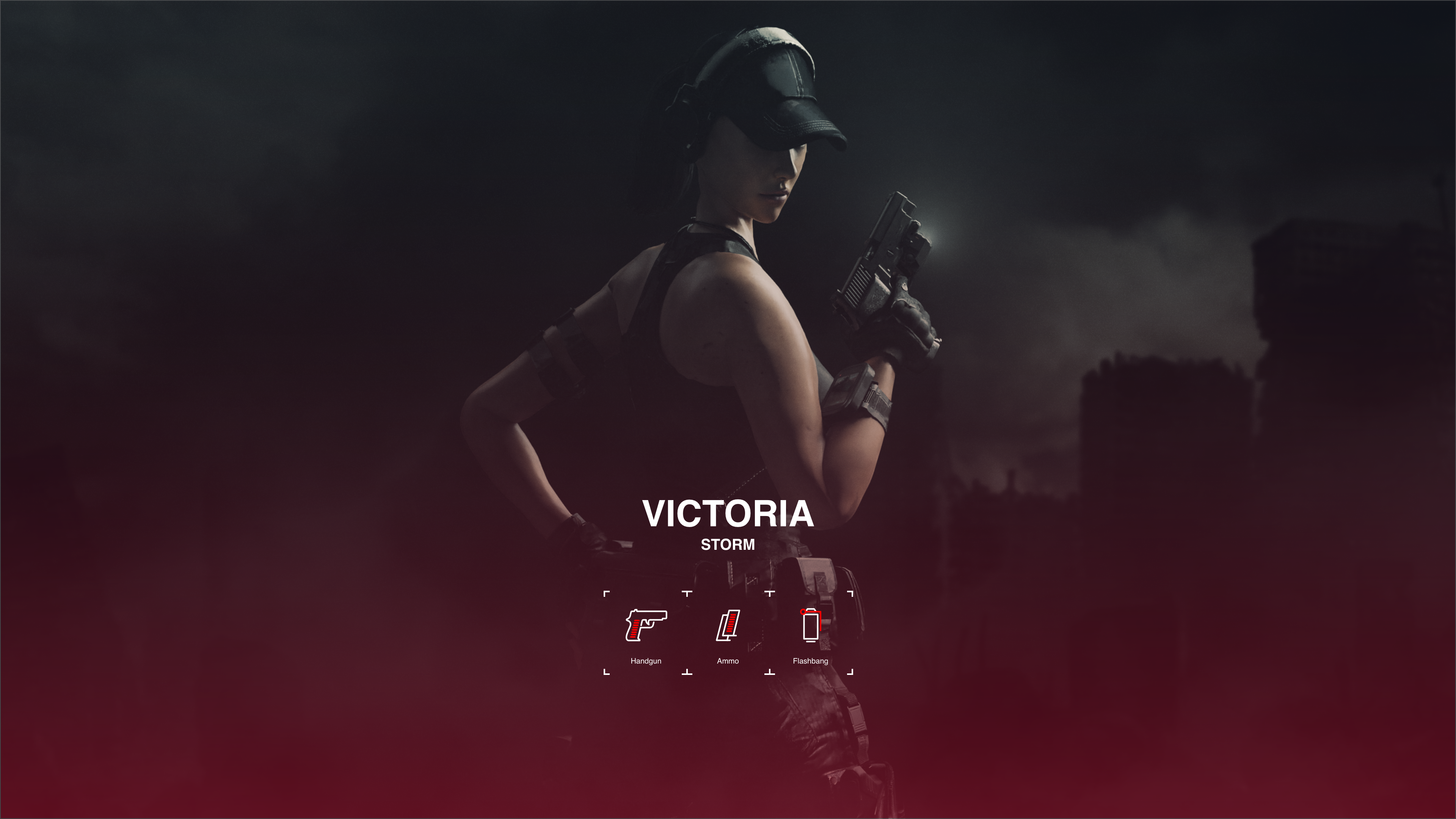
Atmospheric background featuring eerie artwork and strategic use of colors.
Clear and intuitive navigation options for starting a new game, accessing settings, and selecting a playable character.
Created intuitive and visually distinctive representations of each weapon that players can easily recognize and interact with during gameplay
Maintained consistency in style and color palette across all weapon icons to ensure cohesive visual aesthetics within the UI.
Outcome
The UI design for "The Revenant" successfully captures the essence of the game's horror and action themes while providing players with an intuitive and immersive user experience. By prioritizing thematic consistency and accessibility, the UI enhances the overall gameplay and contributes to the atmospheric storytelling of the horror adventure waiting for the player.