MediNOW
Dashboard Design
Role: UX Designer
Software: : Figma
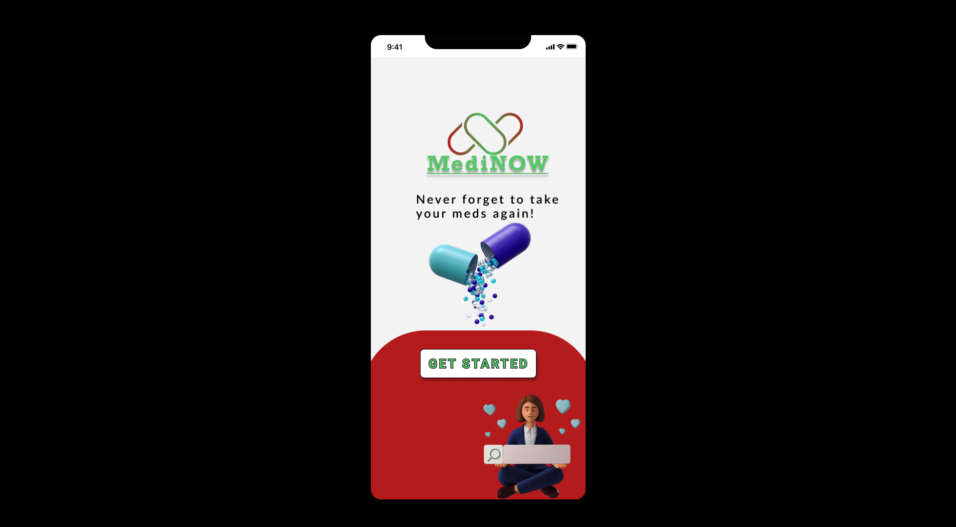
MediNOW is medication reminder app created for social good. MediNOW’s primary target users include young adults to senior citizens who are concerned about taking their medication on time.
Responsibilities
Conduction interviews, paper and digital wireframing, low and high-fidelity prototyping, conducting usability studies, accounting for accessibility, iterating on designs and responsive design.
The Goal
Design an app that will help remind people to take their medication on time.
The Problem
50% of people forget to take their medication at least once a month. Research shows that forgetting to take medication can be related to how many times a day a medication is prescribed. The more often a medication is prescribed, the more likely it is that the medication will be forgotten.
User research: Summary
I used research data on missing medication to develop interview questions, which were then used to conduct user interviews. Most interview participants reported feeling bad about missing their medicine, but they didn’t actively try to change that habit. The feedback received through research made it clear that users would be open and willing to change that habit if they had access to an easy-to-use tool to help remind them.
Personas
Tina Stewart - age 25
Product Manager
"I am juggling so many things that I sometimes forget to take my own meds"
Tina is a busy first time mother experiencing postpartum depression who needs to ensure that she takes care of herself and her baby providing medication for both on time while also being hassle free.
Problem: Tina is a first time mother who needs reminders to take her medications because she is busy taking care of her new born child.
James Darby - age 55
Construction worker
"I am not a tech savvy person so i just want the whole process to be easy and convenient for me."
James is an unmarried construction worker who works 12 hour shifts. He doesn't have time to look at his phone during his work so he wants reminder phone calls or SMS to notify when it is time to take his medication.
Problem: James is an unmarried construction worker who needs an easy way to remind him about his medication because he is always busy with work and forgets his pills
Ideation
I did a quick ideation exercise to come up with ideas to address user goals and frustrations. My focus was specifically on making the process very easy, simple and straightforward.
Digital Wireframes
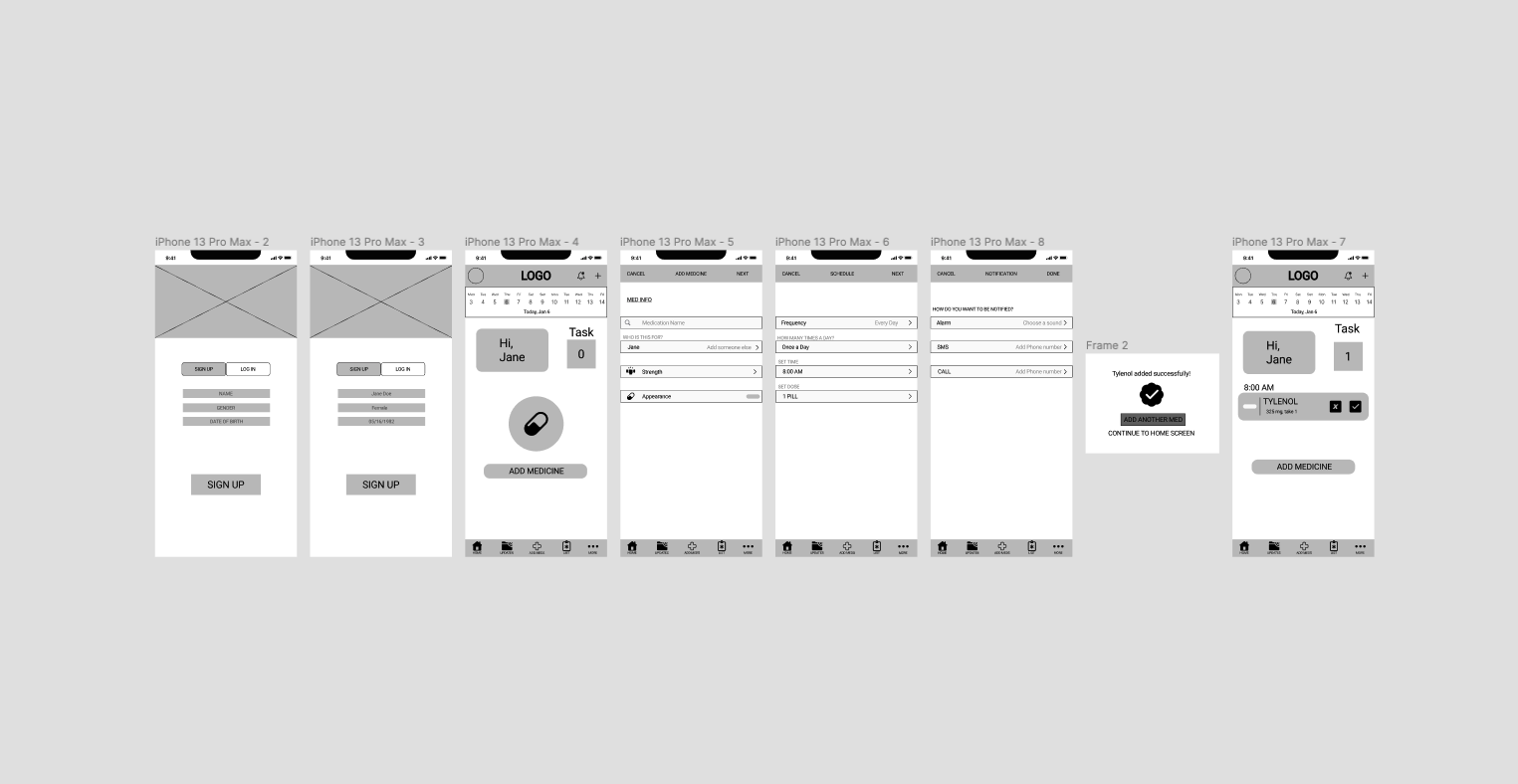
After ideating and drafting some paper wireframes, I created the initial designs for the MediNOW app. These designs focused on making the user interaction easy and welcoming.
Low-fidelity prototype
To prepare for usability testing, I created a low fidelity prototype that connected the user flow of adding a medicine and setting reminders.
Usability study: parameters
Study type:
Unmoderated usability study
Participants:
5 participants
Location:
U.S.A , Remote
Length:
30-60 minutes
Usability study: findings
Additional User Clear labels for interactive elements that can be read by screen readers.
Notifications People preferred to have the option to choose the method of notification
Widgets People had difficulty understanding the purpose of each icon.
Final

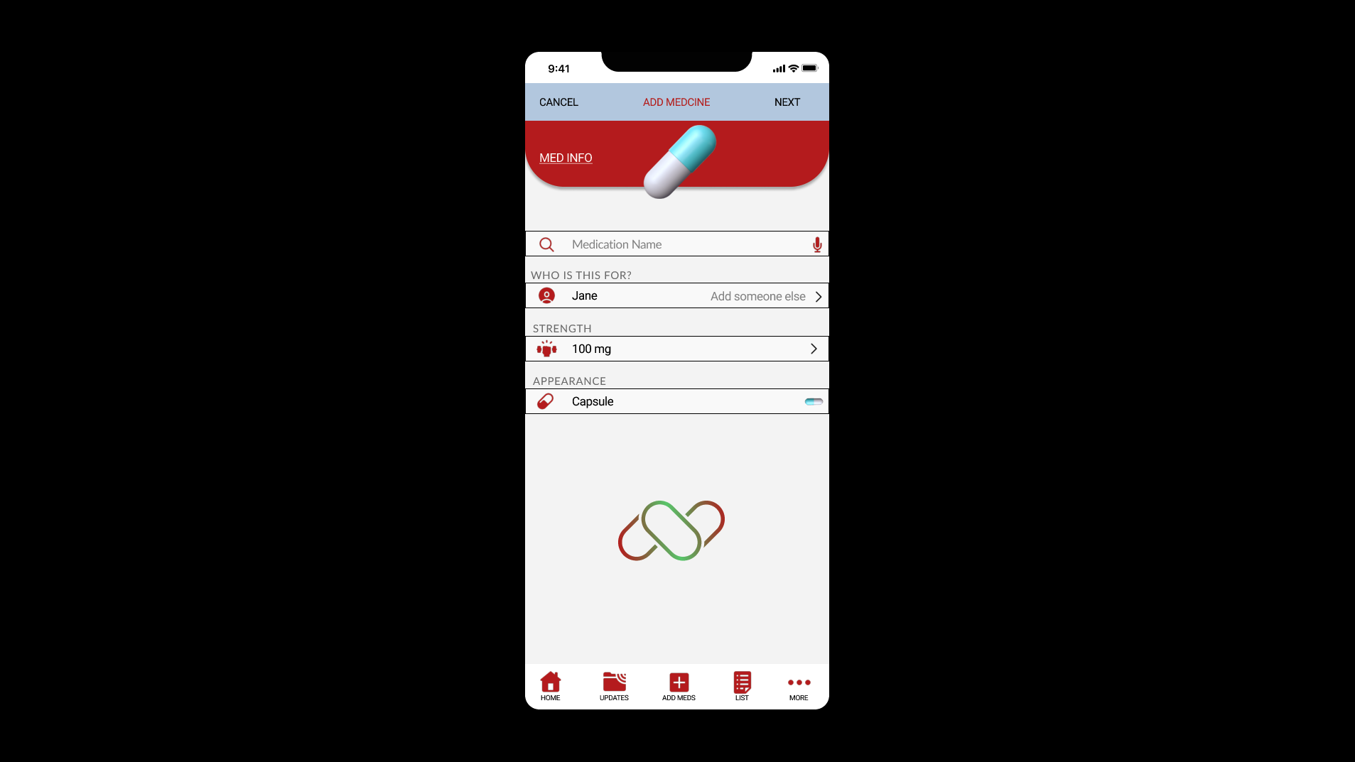
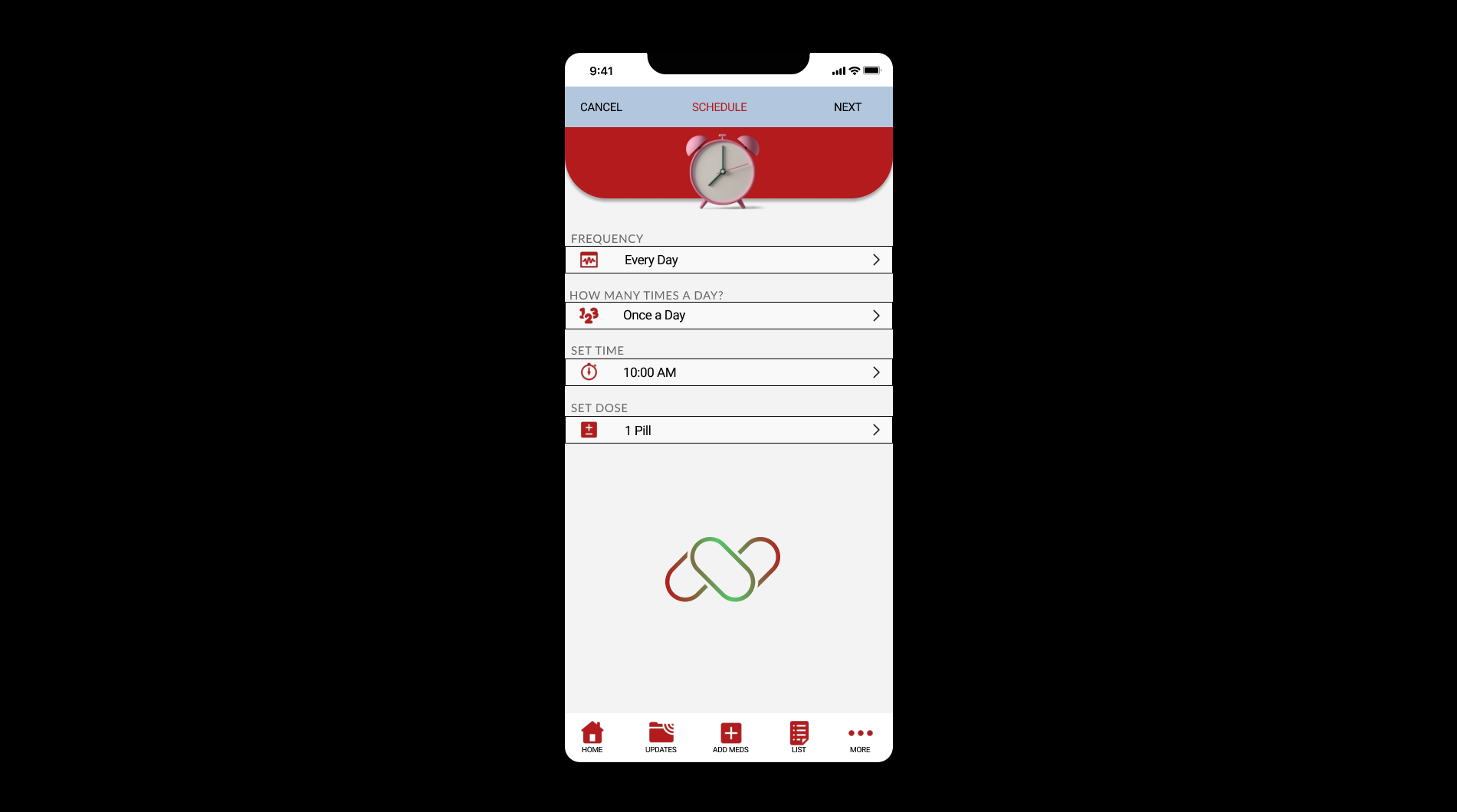
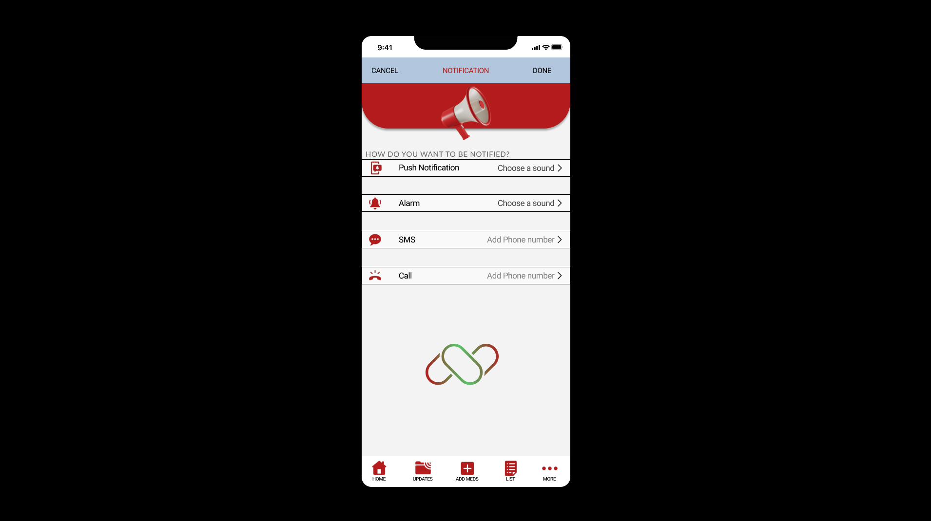

High Fidelity Prototype
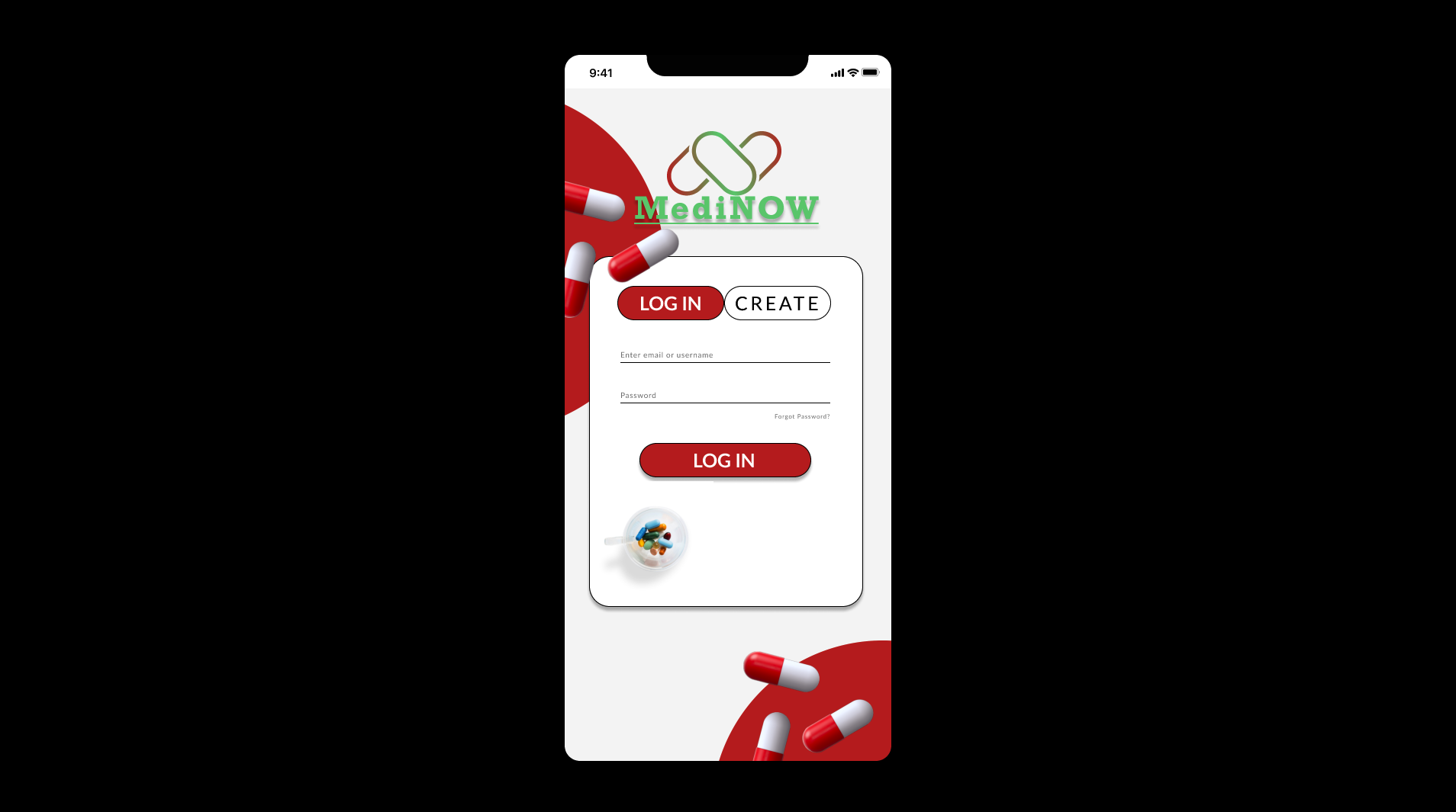
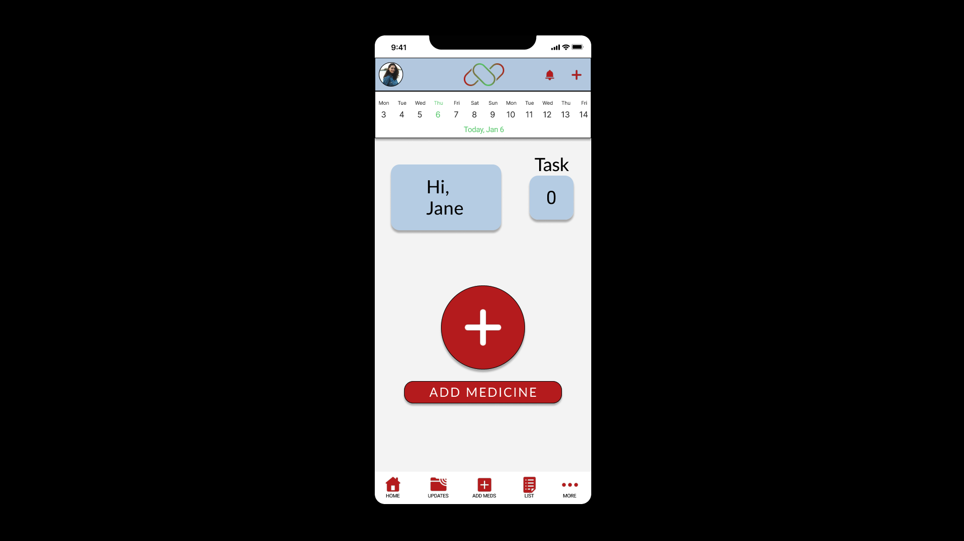
The high-fidelity prototype followed the same user flow as the low fidelity prototype, including design changes made after the usability study.
Accessibility considerations
Clear labels for interactive elements that can be read by screen readers.
Initial focus of the home screen help define the primary task or action for users
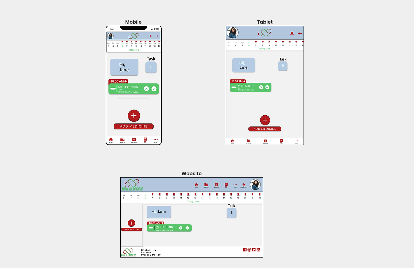
Responsive Designs
Takeaways
Impact: Users shared that the app made forgetting their medication seem like something they could actually help reduce. One quote from peer feedback was that “the MediNOW app makes caring about our own body and health easy and engaging.”
What I learned: I learned that even though the problem I was trying to solve was a big one, diligently going through each step of the design process and aligning with specific user needs helped me come up with solutions that were useful and feasible.
Next steps
Conduct research on how successful the app is in reaching the goal to reduce the chance of forgetting to take medication.
Add medical support and online Q&A for users to keep track of their health and treatments
Provide fun rewards or encouraging words to users for successfully taking and completing their tasks on time

