Enterprise Foundation Solutions - UX Case Study
UX Case Study: Enterprise Foundation Solutions
"Foundation Solutions" represents this project pseudonymously due to confidentiality agreements. Core details (challenges, solutions, outcomes) remain accurate.
What I do
- Experience Owner - UX design
- Writing
- Research
- Project Management
My Tools
- Sketch
- Invision
Project Overview
Foundation Solutions, part of Global Human Resources, delivers trusted, in- house solutions to Enterprise partners through screen printing, letter fulfillment and kitting services. Enterprise’s Foundation Solutions division focuses on fulfillment, graphic arts/printing, and inventory management services. This is the one of the major applications used by LOBs for managing and processing requests for letter, T-shirts printing and support of other event materials.
Different type of requests supported by this application are:
Printworks - Order form is used for mass letters mailing(related to promotions) to be sent out on behalf of Enterprise employees.
Assembly Plus - The team handles everything from printing and mailing customer letters to assembling and shipping of kits.
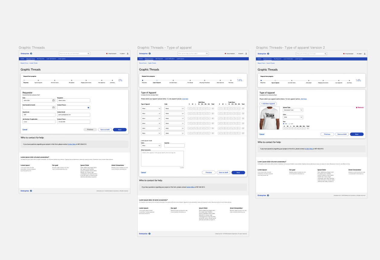
Graphic Threads - Full-service screen printing team handles everything from graphic design to production. Custom designed T-shirts, sweatshirts, sweatpants and towels etc are offered. Users can pick the type of apparel, size, logo and shipping instructions.
Objective
Build a user-friendly application for various LOBs and administrators who will be using the application for placing job requests, management of job requests, processing orders and billing.
Redesign the home page, user forms, contact us page and my requests page while making the interface within current brand standards and UI patterns.
Break the forms into smaller, more manageable sections and provide guided assistance to streamline the order placement process and improve the overall user experience as well as the task completion rate and customer retention rate.
Separate General user view and Admin user view for the entire application.
Challenge
The outdated interface and the use of single long request forms for order placement presents significant challenges for users in terms of cognitive load, navigation complexity, time consumption, user fatigue, error proneness, mobile responsiveness, and loss of context. User frustration with a single long form also impacts the task completion rate, leading to higher abandonment rates, negative user experiences, and decreased customer retention.


- Homepage:
The redesigned homepage enhances user experience by focusing on improving navigation, refining the informational hierarchy and transforming the layout to ensure seamless access to key information. Clear and intuitive navigation menus guide users effortlessly through the website, while strategically placed prominent call-to-action buttons prompt user engagement. Additionally, strategically positioned quick links seamlessly redirect users to other sections of the website or relevant external resources, enriching their browsing experience. The result is a streamlined user journey, fostering exploration and maintaining a cohesive and user-centric homepage design that sets the standard for user experience excellence.
- Contact Us page
The new “Contact us” page focused on improving user engagement and streamlining communication channels. The layout was revamped to enhance accessibility and clarity, ensuring that users can easily locate the information they need. I introduced a user-friendly contact form with clear fields and instructions, simplifying the process of reaching out for help. Additionally, I incorporated multiple contact options, including email addresses and phone numbers to cater to diverse user preferences. By providing a seamless and intuitive contact experience, it made it easier for users to connect with administrators, fostering stronger relationships and enhancing overall satisfaction with the brand.
- My Request page
Revamping the "My Requests" page was a strategic effort to enhance user experience while streamlining the user's journey and optimizing task management. The redesigned page now features a cleaner and more intuitive layout, offering users a comprehensive overview of their requests at a glance. I incorporated a user-friendly filtering system and sorting option, enabling users to categorize and track their requests effortlessly. Additionally, the inclusion of real-time status updates keeps users informed about the progress of their requests. The improved design fosters transparency, reduces user frustration, and ultimately enhances user satisfaction with a more efficient and user- centric "My Requests" page.
Request Forms (Printworks. Assembly Plus, Graphic Threads)
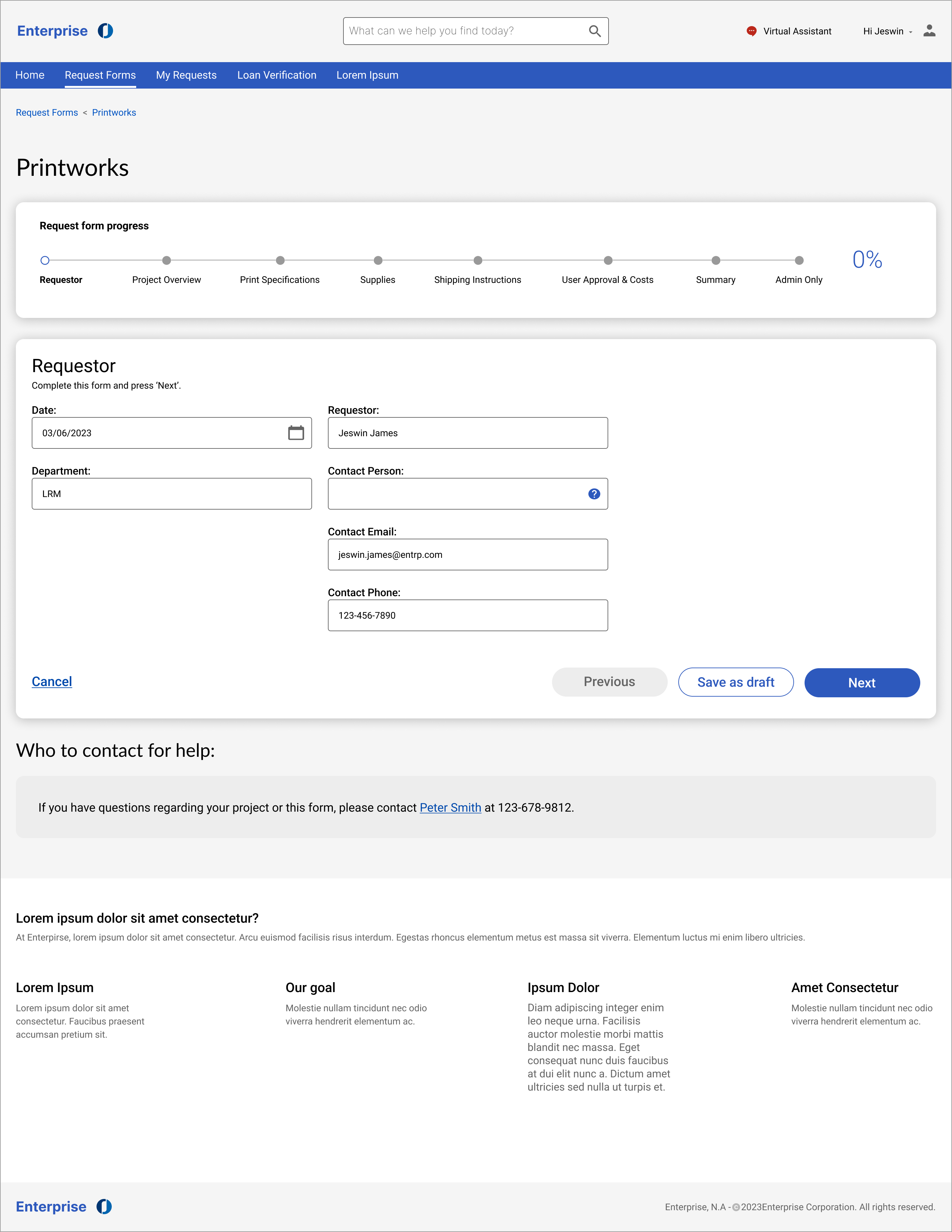
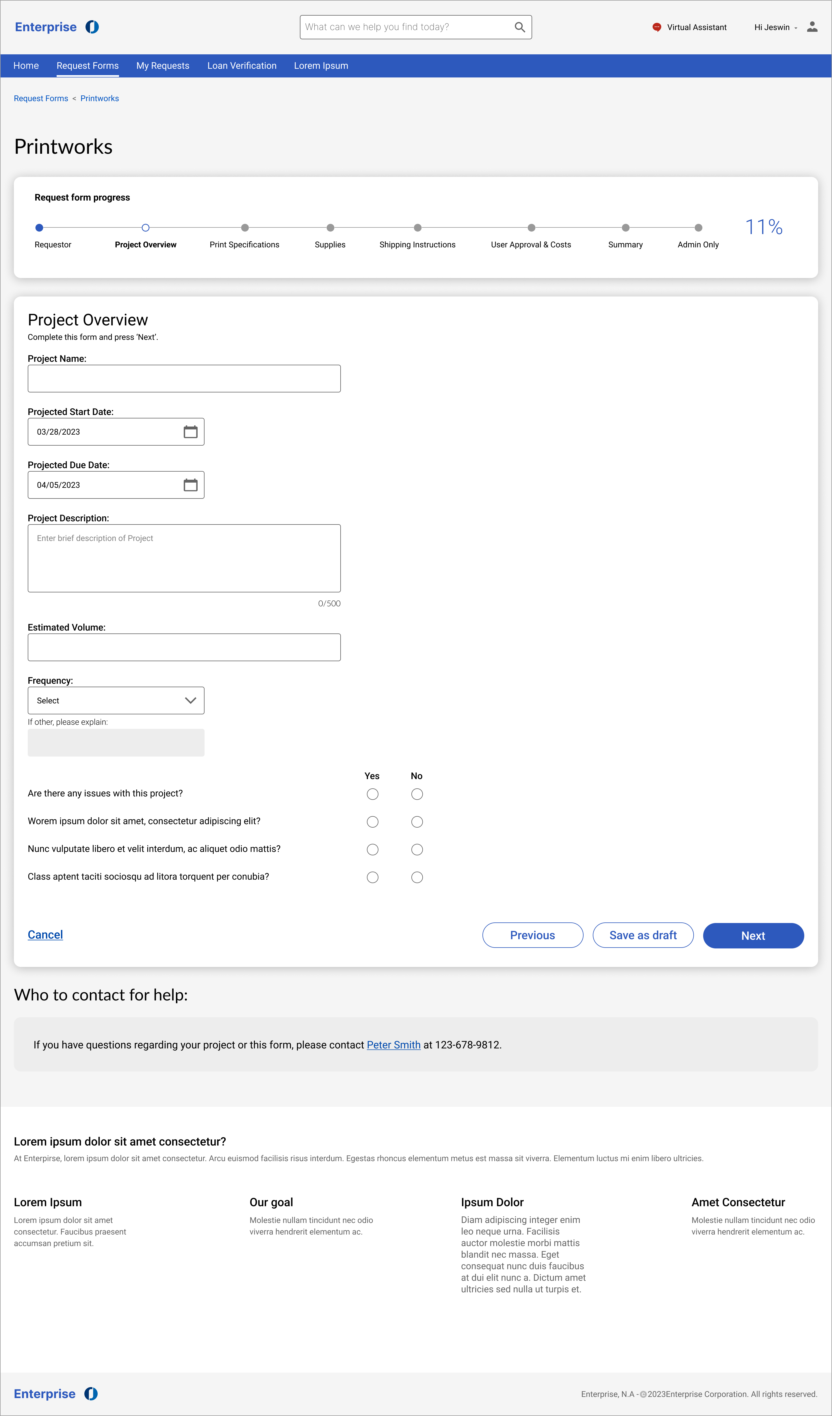
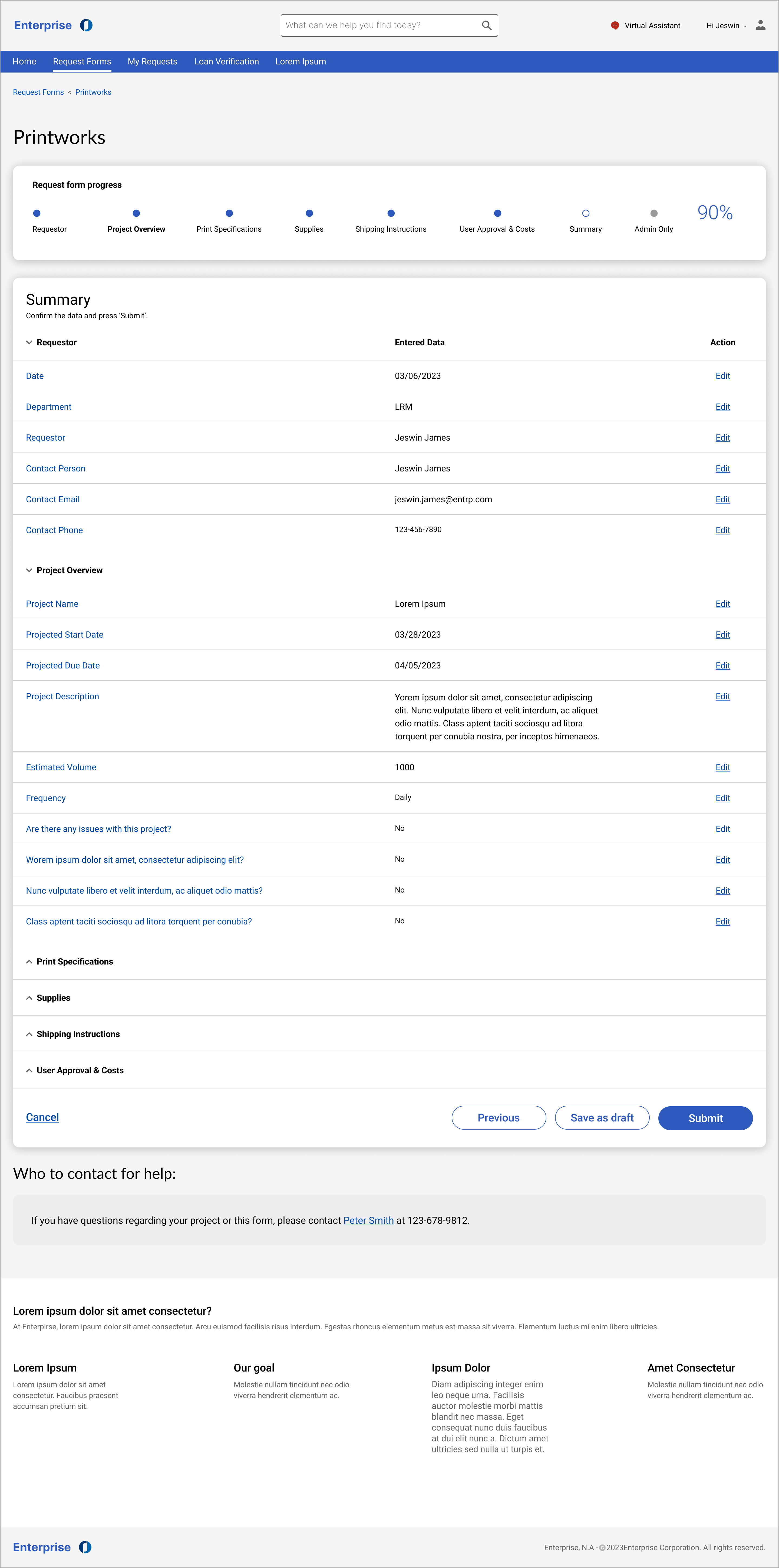


The original long single-page request form was redesigned into a sectional request form with a progress tracker that marks a significant improvement in user experience and efficiency. The new design breaks down the form into manageable sections, allowing users to focus on one aspect of the request at a time. With a progress tracker prominently displayed, users can easily track their progress and understand how far they've come in completing the form. This segmented approach reduces cognitive overload and enhances clarity, resulting in a smoother and more streamlined request submission process. Users can navigate through the sections seamlessly, saving time and minimizing frustration. Overall, the redesign improves usability, increases completion rates, reduces human error, and ultimately enhances user satisfaction with our request submission process.
Usability Test
“The new design looks cleaner and is easier to understand than the existing interface. Filling out the request form is so easy now as well as digesting the information” - Administrator quote
Participants: The candidate list for the usability test consisted of Administrator users and new users. The usability test revealed overwhelmingly positive feedback from participants regarding the redesigned interface, navigation, information accessibility, and task completion satisfaction. Participants expressed a high level of satisfaction with the new interface, praising its modern and intuitive design. The segmented request form with a progress tracker received particular acclaim, with participants finding it easy to navigate and understand. They appreciated the clear structure of the form, which allowed them to focus on one task at a time, leading to increased task completion satisfaction. Additionally, participants found the information accessibility to be greatly improved, as they could easily locate the information they needed and who to contact for help. Overall, the usability test demonstrated that the redesign successfully addressed user pain points and significantly enhanced the user experience, resulting in positive feedback and increased satisfaction among participants.
Possible next steps:
Outcome
The positive feedback from participants in the usability test indicates that the redesign of the interface has significantly improved user experience and satisfaction. The streamlined navigation and information accessibility have resulted in enhanced task completion rates and reduced user frustration. The segmented request forms reduced user fatigue and cognitive overload. This highlights that a user-centric design approach in addressing user needs, preferences and their pain points will ultimately lead to a more efficient and enjoyable user experience. The success of the redesign underscores the importance of continuous iteration and improvement in delivering solutions that truly resonate with users.