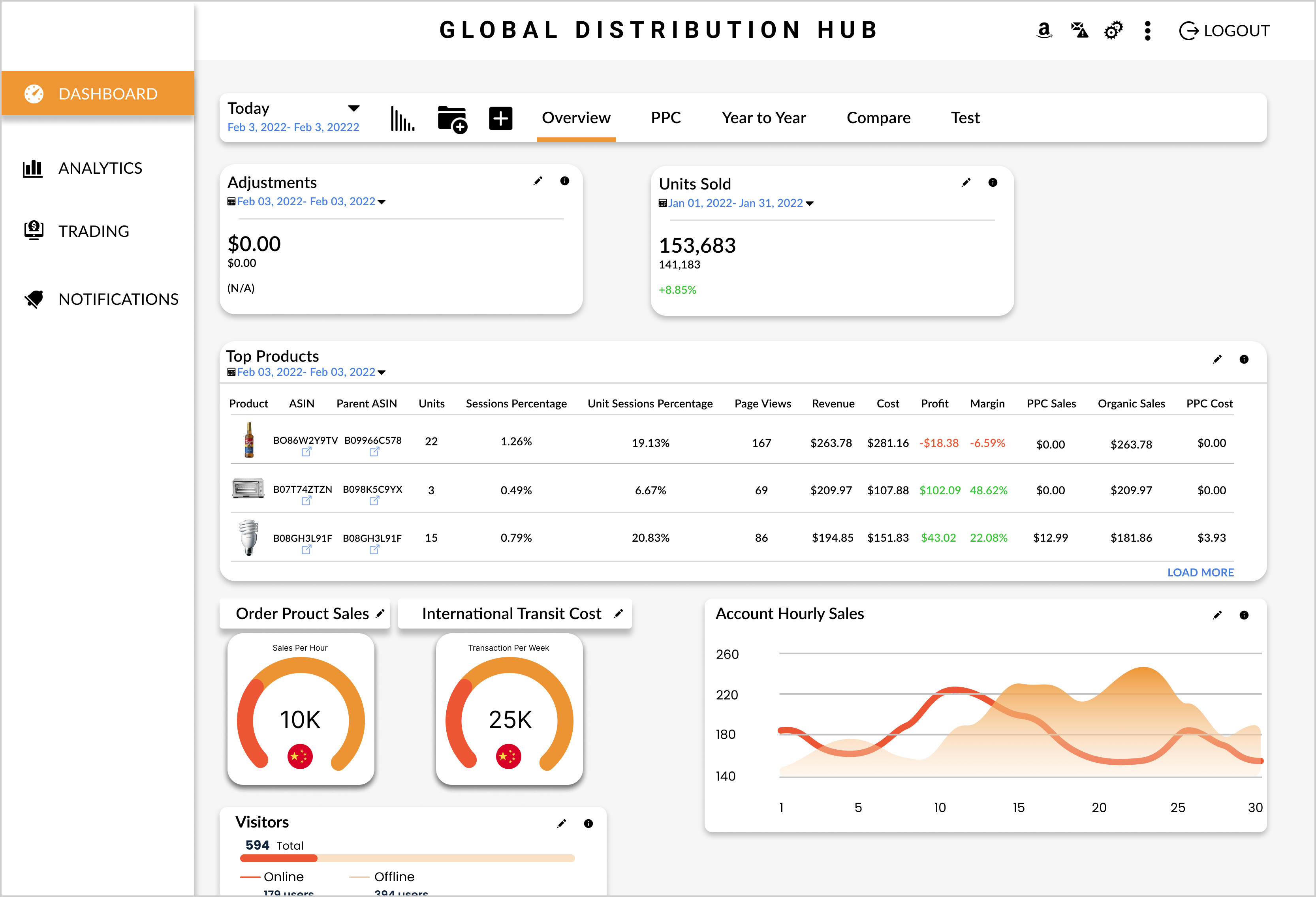
Dashboard Concept For Global Distribution
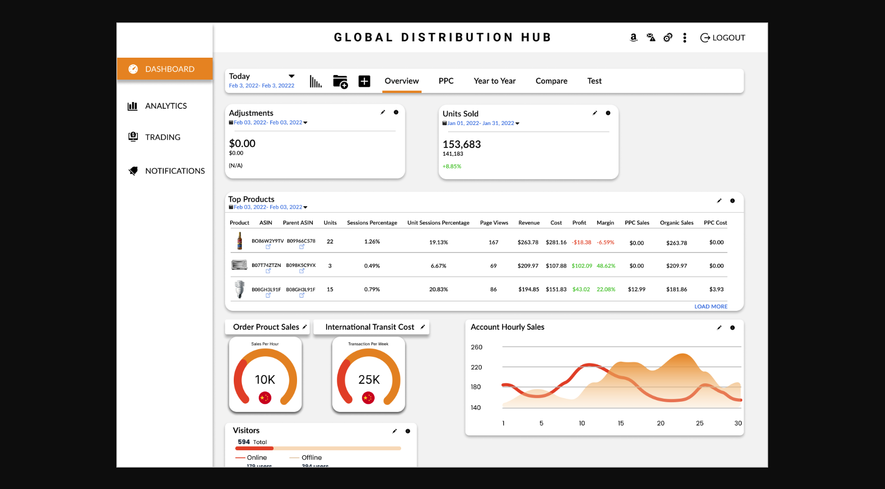
Dashboard Design
Role: UX Designer
Client: Global Distribution
Software: : Figma
Problem
Dashboard design includes too much information which overwhelms the user.
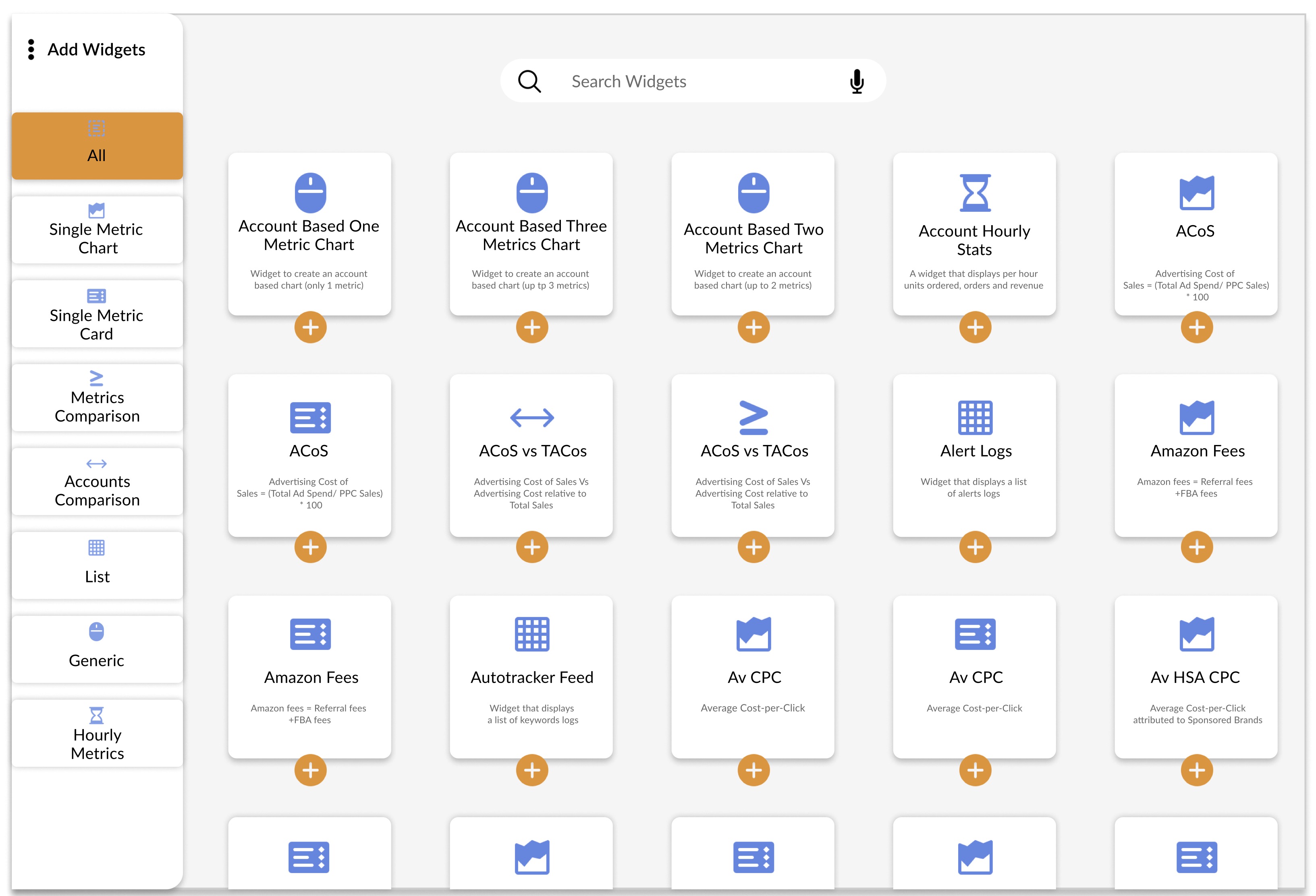
Objective
To make customizable and user friendly dashboard for sales and analytics and to also make dashboards limited in size to a single page in order to provide the user with an at-a-glance summary of the key performance indicators.
Color scheme: Orange, red
Orange: Confidence, Success, Sociability
Red: Power, Urgency, Excitement
Blue: Tranquility, Integrity, Wisdom
Typography: lato, inter, Poppins
Lato: For Body content to appear to be approachable
Inter: For user interfaces, focusing on the high legibility of small and medium-sized text on computer screens.
Poppins: To create an extremely versatile effect for your text, easily and pleasantly readable.