Battle Royale UI Design
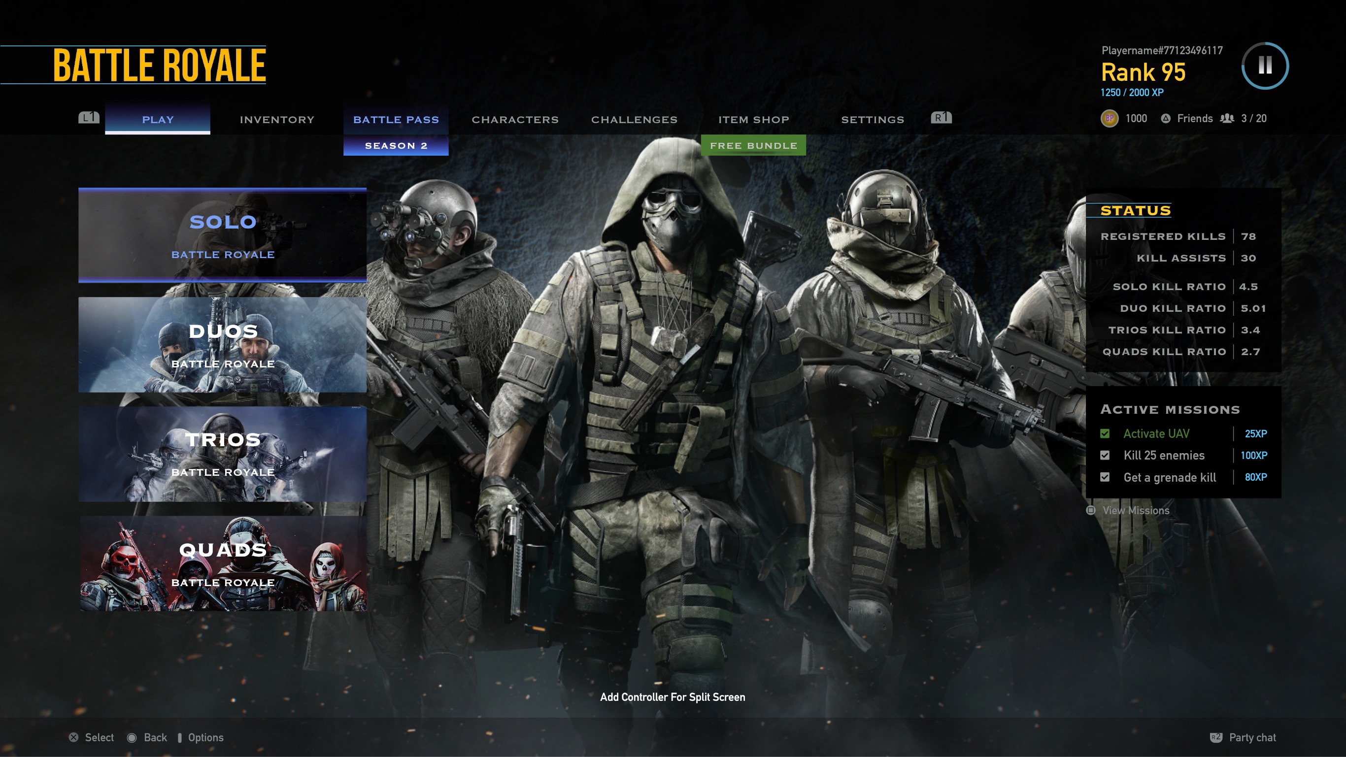
UX Case Study: Battle Royale Game Mode UI
The battle royale mode is a dominant force in the gaming industry, captivating millions of players worldwide with its adrenaline-fueled gameplay and competitive edge. In this mode, players are thrown into a shrinking arena where they must scavenge for weapons, outmaneuver opponents, and fight to be the last one standing. With a passion for gaming and a dedication to user experience, I set out to design a home screen that would serve as the gateway to an immersive and exhilarating experience for players.
What I do
- User & Product Research
- UI / UX Design
My Tools
- Adobe XD
- Procreate
Objective
The primary goal was to design a battle royale game mode home screen that would provide players with easy access to key features, enhance engagement, promote a sense of excitement and immersion and also address the pain points that players often encountered with clunky and cluttered user interfaces. Specific objectives included:
- Creating a visually appealing and immersive interface that captures the essence of the battle royale genre.
- Designing intuitive navigation and information architecture to streamline access to game modes, settings, and player progression.
- Incorporating dynamic elements and visual cues to highlight important updates, events, and promotions.
User Pain Points
Through user surveys, feedback forums, and personal gaming experiences, several key pain points emerged regarding existing battle royale game mode home screens:
- Clunky Navigation: Players often found themselves struggling to navigate through convoluted menus and submenus to access essential features such as game modes, settings, and progression.
- Information Overload: The home screen was often cluttered with excessive information, making it difficult for players to focus on what mattered most, leading to a feeling of overwhelm and confusion.
- Inconsistencies in Design: Inconsistent visual elements and erratic placement of buttons and menus contributed to a disjointed user experience, hindering players' ability to interact with the interface efficiently.
Research
For the design process, I conducted the following research:
- User Surveys: Gathered feedback from current players to understand their preferences, pain points, and expectations for a battle royale game mode home screen.
- Market Analysis: Analyzed the home screens of existing battle royale games to identify best practices, trends, and areas for innovation.
Final Design

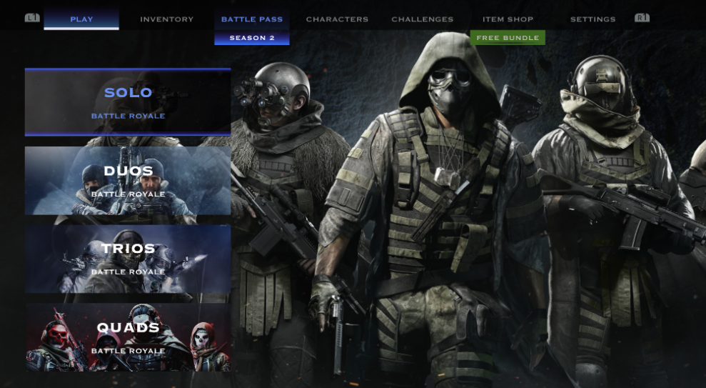
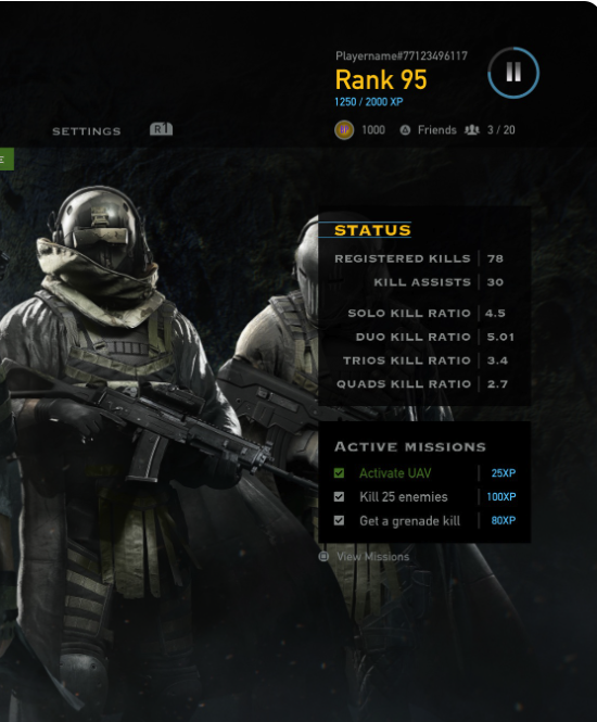
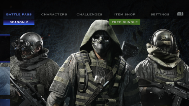
- Immersive Visuals
Atmospheric background imagery, dynamic animations, and thematic elements that evoke the adrenaline-fueled excitement of the battle royale experience.
- Streamlined Navigation
Clear and intuitive navigation menus and buttons for quick access to game modes, settings, and social features. Utilized a tab-based system to organize content logically and reduce the need for excessive scrolling or digging through menus.
- Simplified Layout
Adopted a minimalist design approach, with clean lines and clear visual hierarchy to reduce clutter and prioritize important information.
- Dynamic Content
Dynamic banners and notifications highlighting important updates, events, and promotions to keep players engaged and informed.
Outcome
The redesigned battle royale game mode home screen received positive feedback from users during usability testing, with many fellow gamers noting improvements in navigation, clarity, and customization options. The positive feedback affirmed that the home screen had succeeded in its mission to bring excitement to players while immersing them in a clutter free and clean game UI.
Conclusion
Designing the battle royale game mode home screen was more than just a design project; it was a personal endeavor filled with passion, creativity, and a deep understanding of player experiences. By addressing user pain points related to clunky and cluttered UI, the redesigned home screen succeeded in providing players with a more streamlined and immersive entry point into the battle royale game mode. Through thoughtful design solutions and user-centered iteration, the interface enhances the overall gaming experience for players.